This tutorial will teach you how to build an About Me app using Interface Builder and Autolayout. Before we start building our app, though, let’s talk about Autolayout.
In The Beginning
When the iPhone first came out (over ten years ago!), there was only one screen size. Back then, it was ok to specify everything on screen in terms of pixels. We could set a view to be at (100, 300) with size (200, 200) and it would always look the same, no matter what phone it ran on.
This isn’t true anymore. We have 4 different iPhone sizes and 3 different iPad sizes. It would be a nightmare to manually specify pixels values for every device.
A View’s Frame
Every view must have two different properties to be drawn on screen:
an origin (x, y) and a size (width, height).
Together, these two properties constitute the view’s frame. It sounds obvious, but determining those frames can be difficult. Pixels values explicitly define a view’s frame. In contrast, Autolayout uses constraints to infer a view’s frame from a set of relationships.
Autolayout Constraints
Constraints are the bread and butter of Autolayout. Constraints are relationships between two views. In English, typical constraints would include things like “the top of this view is 10 pixels from the bottom of this view” and “this view is centered inside its superview”.
We can reconstruct the previous example using constraints instead of pixel values:
- 200 pixels wide
- 200 pixels tall
- Centered horizontally
- Centered vertically
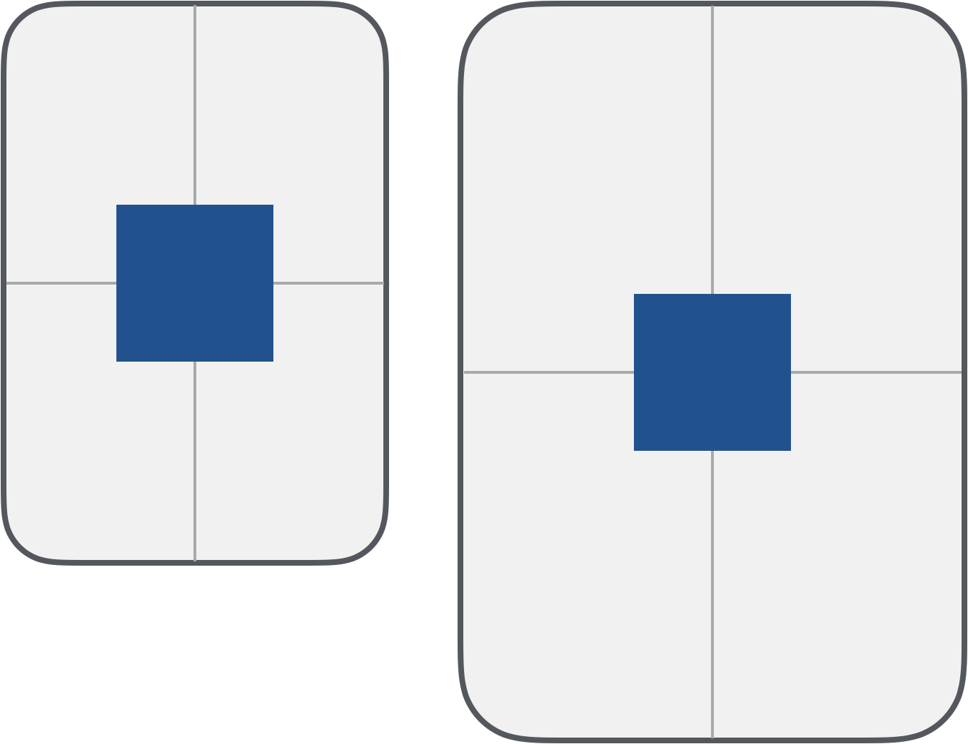
With these constraints, the rectangle stays centered as the screen gets larger.
Constraining Views Relative To Eachother
We can also constrain views relative to eachtother. This is what makes Autolayout useful for complex app layouts.
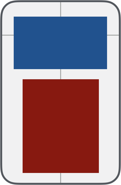
In this example, we have two views with four constraints each. The blue view has these constraints:
- 20 pixels from the top
- 20 pixels from the left
- 20 pixels from the right
- 200 pixels tall
The red view has these constraints:
- 20 pixels below blue
- 80% the width of blue
- Centered horizontally
- 20 pixels from the bottom
Notably, these constraints never specify how tall red should be. Based on this relationships, though, it’s easy to infer how tall the view should be. This is exactly what Autolayout does.
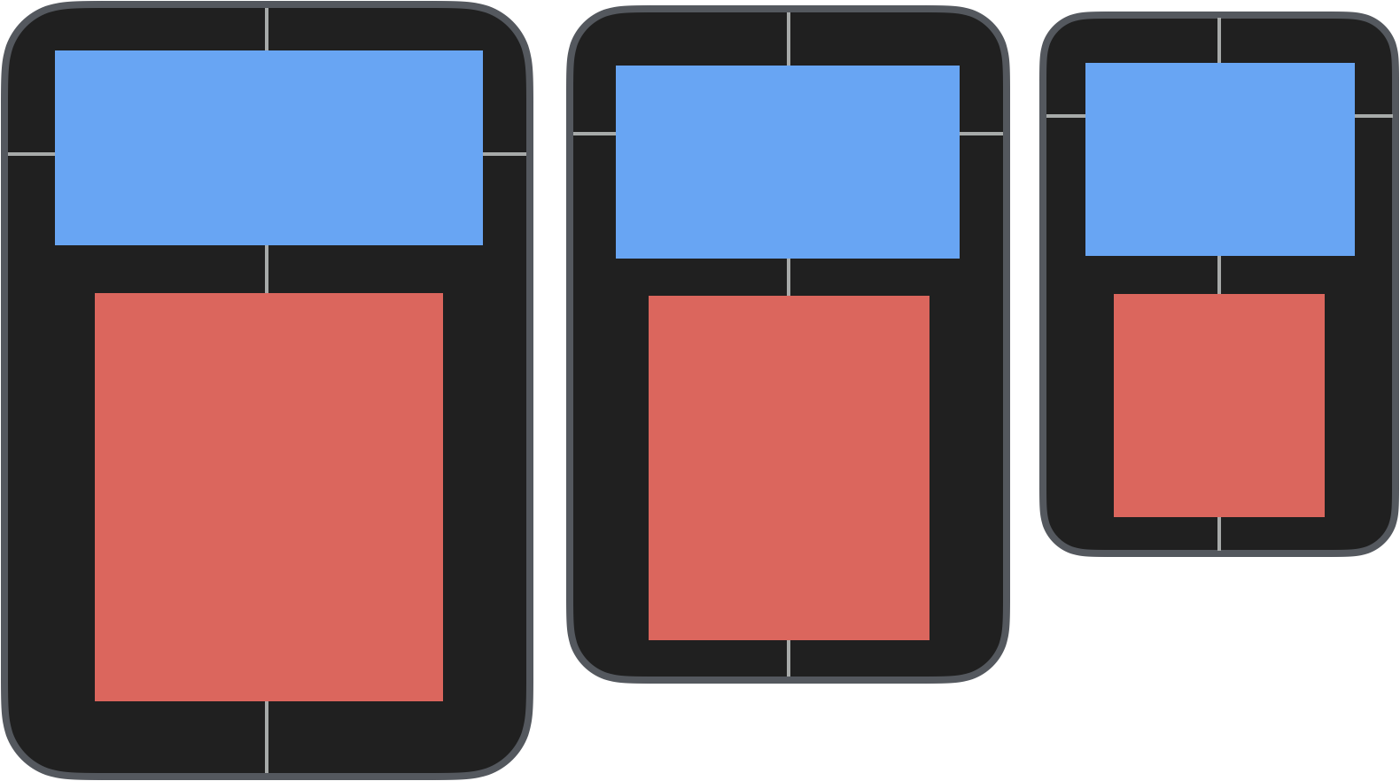
As we decrease the screen size, blue stays the same height and in the same relative position while red gets progressively smaller:
With a basic understanding of Autolayout, we can start working on our About Me app.