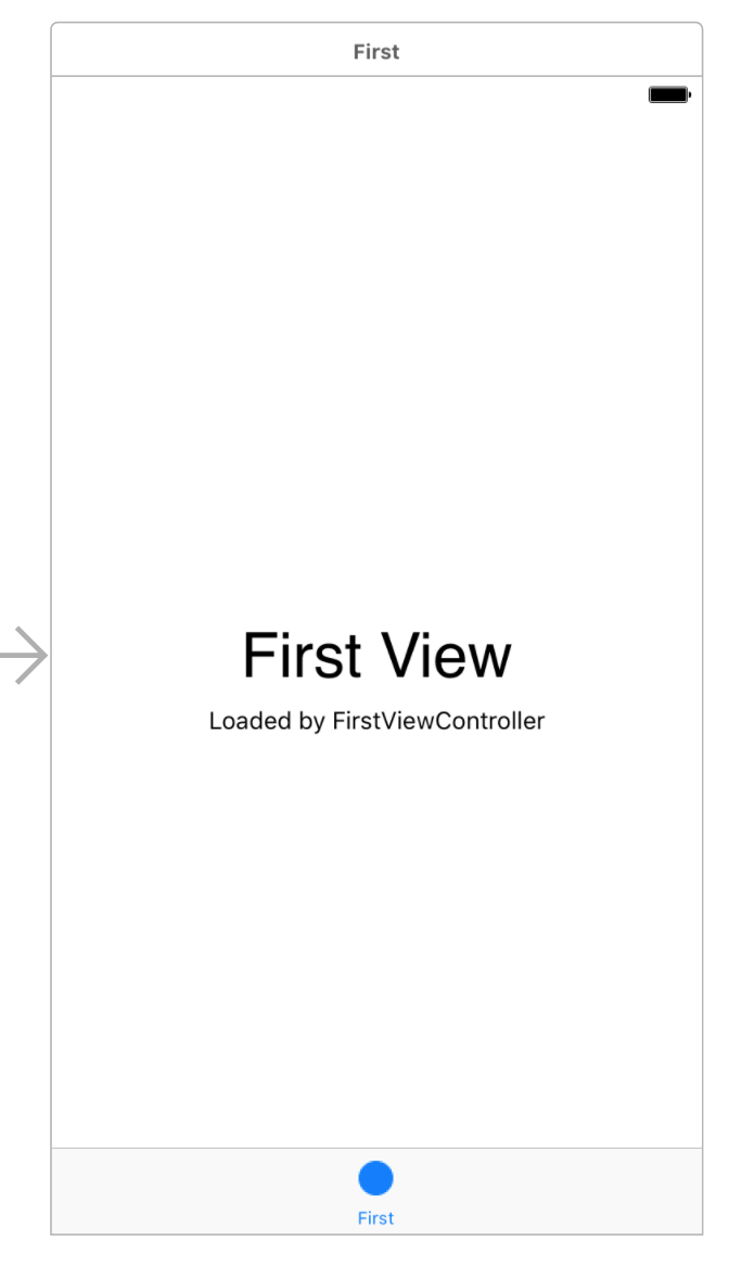
Now that we’re familiar with Autolayout and Interface Builder, we can start designing the first View Controller. It has a few labels in it by default, but you can delete them.
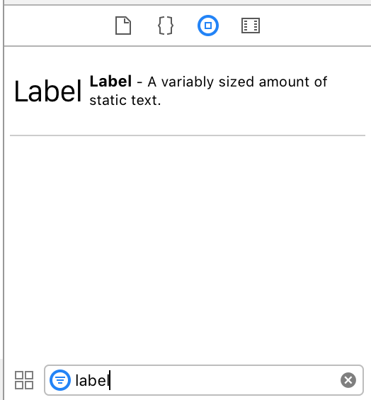
We’ll start by adding a Label to the View Controller. In the View Palette, you can search for “label” and then drag one onto the canvas.
Our First Constraints
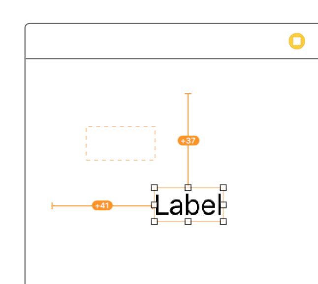
Before we go any farther, we want to add constraints to this label. We want it pinned to the top left corner, so we can add these constraints:
- 20 pixels from the top
- 20 pixels from the left
Notably, we don’t have to tell the label what it’s size should be. Since the label has a font size and a piece of text (“Label” at 17pt font by default), Autolayout knows how big it should be. This expected size is the label’s intrinsic size.
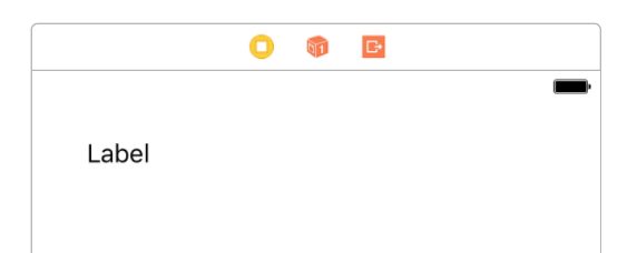
It’s fairly straightforward to add these two constraints. At the bottom right of the canvas, there’s a set of buttons to manage constraints:

The second button from the right (the one that looks like a Tie Fighter) lets us add new constraints. Select the label and click this button.
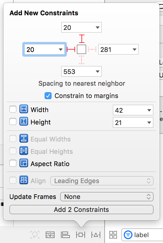
At the top of the popup, you can control the Spacing to nearest neighbor. Typing a value or clicking the dotted red arrow adds a new constraint relative to the closest neighbor in that direction.
In this case, we want to set the label to be 20 pixels from the top of the screen and 20 pixels from the left of the screen. Set those values and click Add 2 Constraints at the bottom.
Back in the canvas, your label should have turned orange. This means that it’s current frame in Interface Builder isn’t correct based on the constraints you’ve specified.
The dotted orange line is the frame your constraints specify. If you press the key command Command-Option-Equals (⌘⌥=), the view’s frame will update. It should snap in place and turn blue:
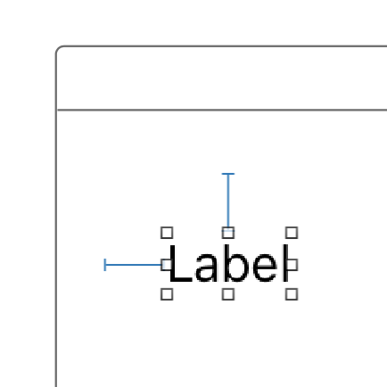
Blue is good. It means your constraints are working correctly (as long as you see what you expect).
Customizing the Label
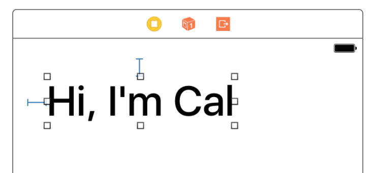
With the label constrained, we can customize it however we want. Select the label and then visit the Attributes Inspector on the left.
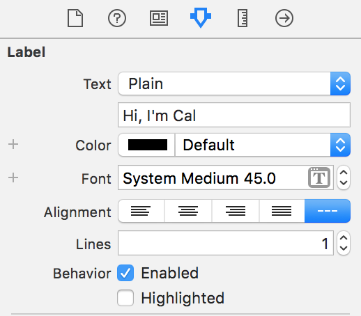
You can set the text, font, and color to whatever you like. As you update the label’s settings in the Attribute Inspector, the label should update accordingly.
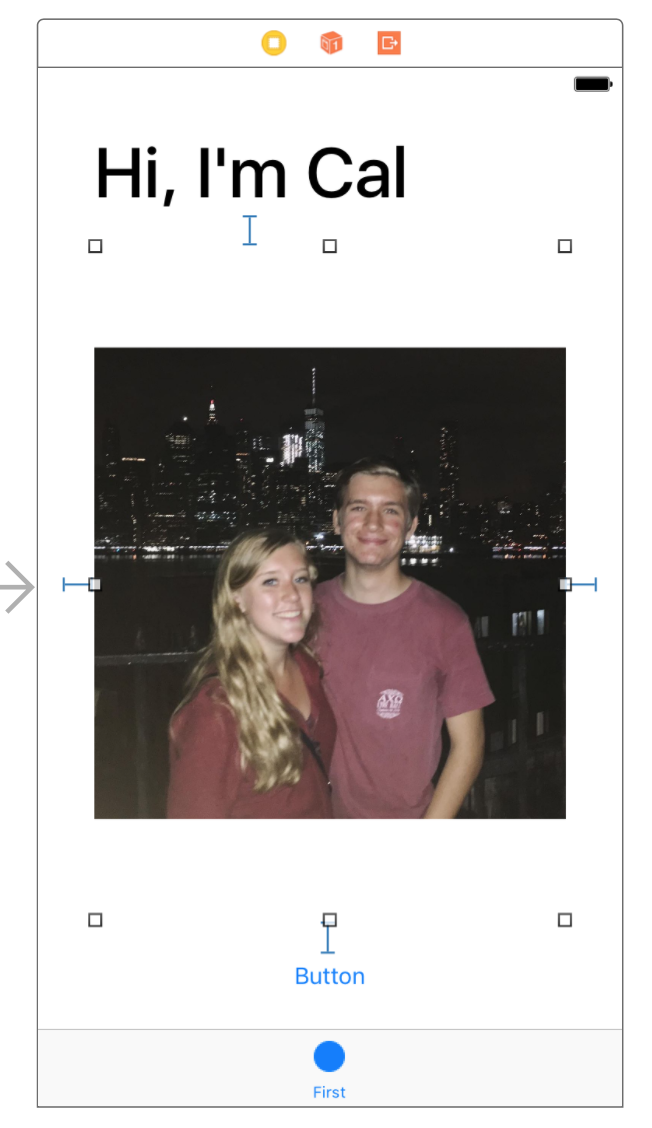
Adding an Image View and a Button
Below the label, drop an Image View and a Button into the View Controller (you can find them in the View Palatte by searching for “image” or “button”):
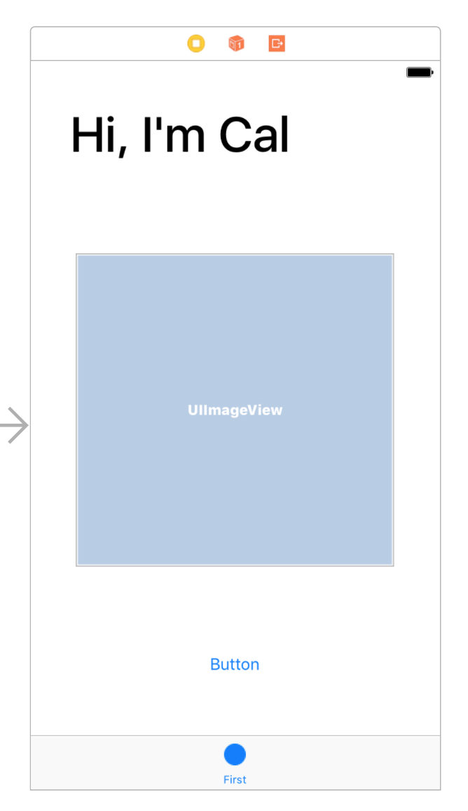
These constraints are also pretty straightforward. We want the Image View and Button to be 20 pixels away from all of their neighbors.
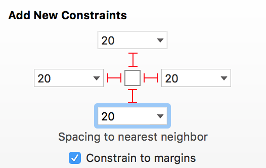
We can add these constraints to the Image View:
And we can add these constraints to the button:
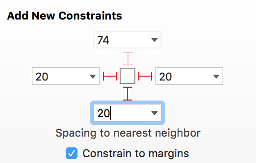
We specifically don’t need to add a top constraint to the button. Since we already said “the image view is 20 pixels above the button”, it would be redundant to also say “the button is 20 pixels below the image view”.
With these constraints added and the frames updated (⌘⌥=), your View Controller should look something like this:
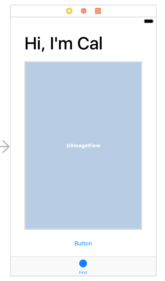
Since the label and the button have text, the both have an Intrinsic Size. Since the image view is empty, it doesn’t care what its size is. Autolayout will allow the label and button to be their natural size and the Image View will grow to fill the space in between.
Choosing an Image
We want to add an image to our Image View, but first we need to add it to our Xcode project. We do this through the Assets.xcassets file:
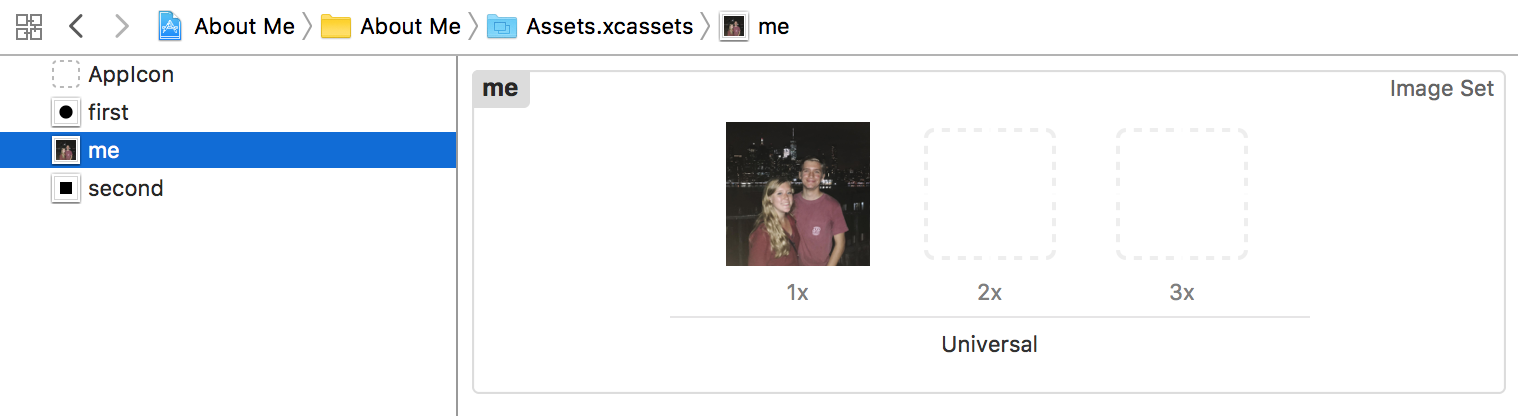
An individual asset is an Image Set, so create a new Image Set by clicking the plus button at the bottom left. Rename the image set to something meaningful and drop your picture in the 1x slot:
1x, 2x, and 3x are related to pixel density. The original iPhone was 1x, a typical Retina Display is 2x (twice as many pixels for the same screen size), and the Plus phones are 3x. Normally, you would want to have different assets for each resolution, but we won’t worry about that for now.
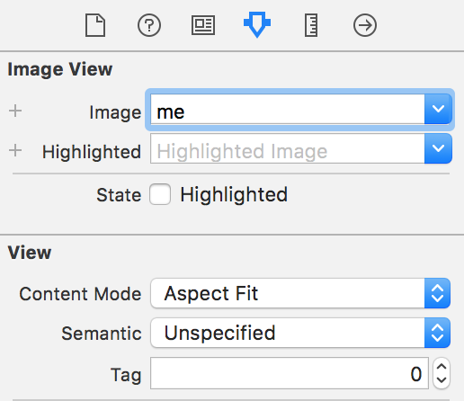
Back in the storyboard, you can select the Image View and choose the image we just added. You should also set the Content Mode to Aspect Fit so your image doesn’t get stretched out.
Now you should see your image on the canvas, but there’s a little problem…
When Constraints are Ambiguous
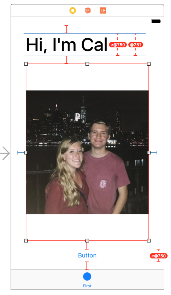
Red is bad. It means your constraints are ambiguous or cannot be satisfied. Everything was alright a second ago, so what changed?
When there was no image in the Image View, it didn’t have an intrinsic size. The Image View didn’t care what size it was. Since it has an image now, it adopts the intrinsic size of that image. In my case, it’s intrinsic size is now (1200, 1200).
Content Compression Resistance Priority
If the image view had it’s way, it would squish the label and button so it could be as large as possible. This is called Content Compression, and views resist compression when possible.
Content Compression Resistance Priority (little bit of a mouthful) is a number between 1 and 1000 that defines how intensely a view resists compression. When two views compete for space, the one with the lowest resistance priority will be compressed.
By default, all views have a Compression Resistance of 750. Since our label, image view, and button all have the same resistance, Autolayout doesn’t know which one it should force to compress. If we lower the image view’s Compression Resistance, Autolayout will know to compress the image view instead of the label or button.
Select the Image View, open the Size Inspector (ruler button), and scroll down to the bottom. You can set the Content Compression Resistance Priority to any number smaller than 750.
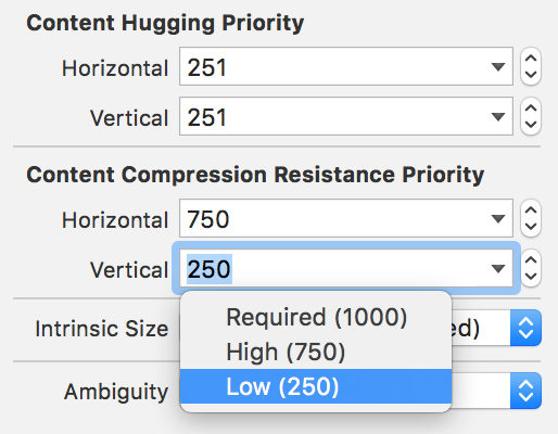
Once you update the resistance priority, everything should turn blue again:
In Part 4, we’ll add another View Controller to our canvas.