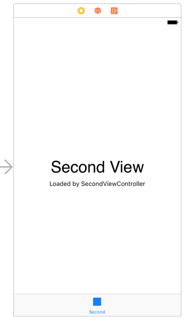
In this last part, we’ll design the second View Controller that we haven’t touched yet. Like last time, it has some default labels that you can go ahead and delete.
A Label
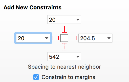
Let’s start with a label at the top left, just like last time. Drop one on the canvas and call it “Interests”. For constraints, use 20 top and 20 left. Remember to update the view’s frame (⌘⌥=) if you need to.
Adding a Stack View
For this layout, we’ll be using a Stack View. Stack Views are a super helpful type of container view that have special properties.
A Stack View automatically creates constraints for its subviews based on a few properties that you have to specify. We’ll take a look at how useful that is in a moment.
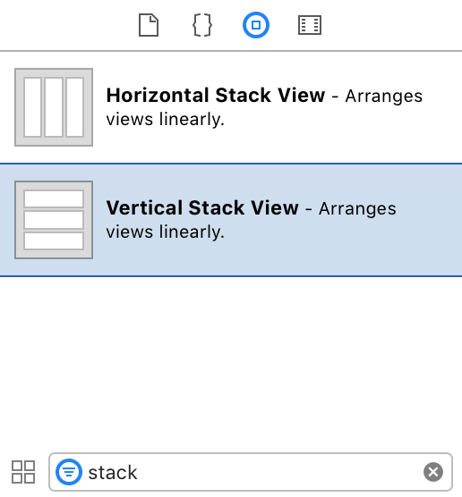
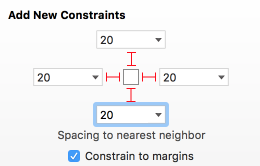
For now, drop a Vertical Stack View on the canvas and constrain it with 20 on all four edges.
A View
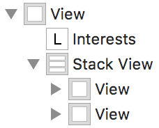
Next, let’s add a View inside the Stack View. When you drop it in, make sure it’s actually inside the Stack View by checking in the View Hierarchy:
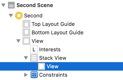
We haven’t specified any constraints for the View we just added, but it very happily knows where it should be:
The Stack View is telling the View to take 100% of its available space, so it’ll handle itself.
Decorating the subview
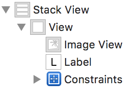
Add an Image View and Label to the View inside the Stack View. It can’t hurt to check the View Hierarchy to double-check these views are actually in the Stack View and not just on top of it:
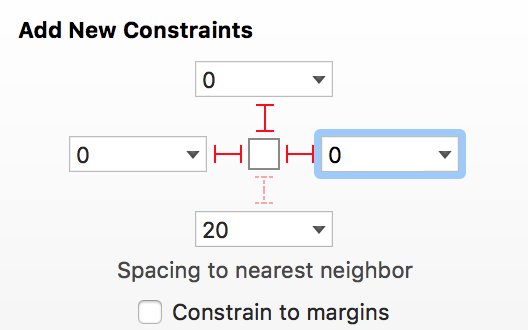
In terms of constrains, set the Image View to be 0 top, 0 left, and 0 right:
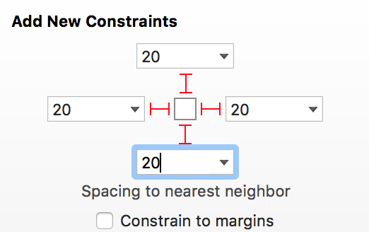
For the label, 20 all around is fine:
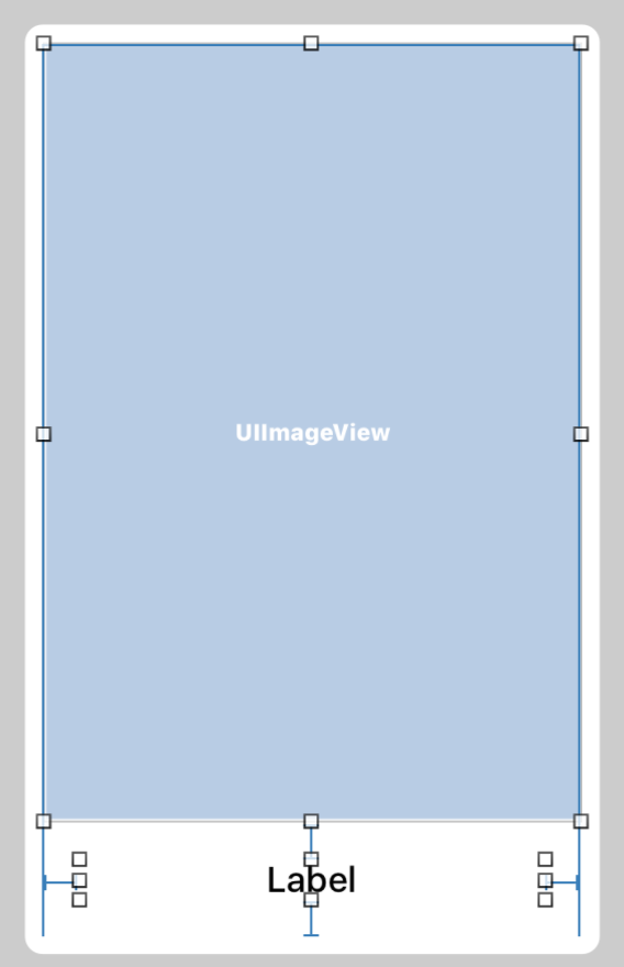
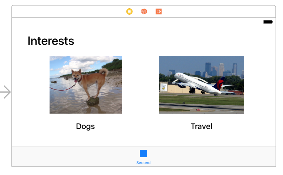
Your Stack View should look something like this:
Adding an Image
Now’s a good time to choose an image for the Image View. Find a picture of something you’re interested in and add it to your Xcode project (take a look at Part 3 if you need a reminder on how to add an image).
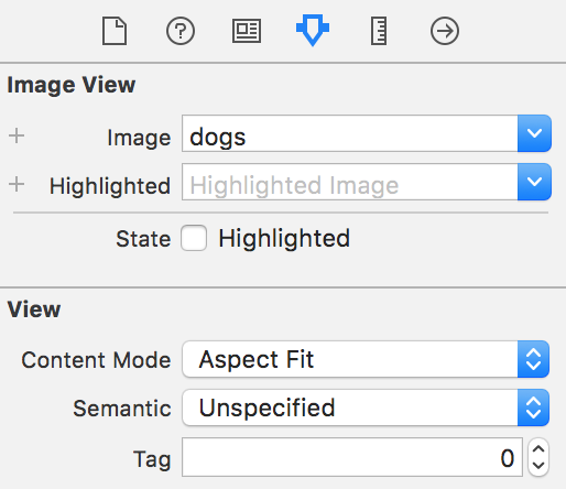
Remember to set the Image View to Aspect Fit, or your image might come out a little wonky.
More Ambiguous Constraints
Like last time, the image is gonna cause some issues with our constraints.
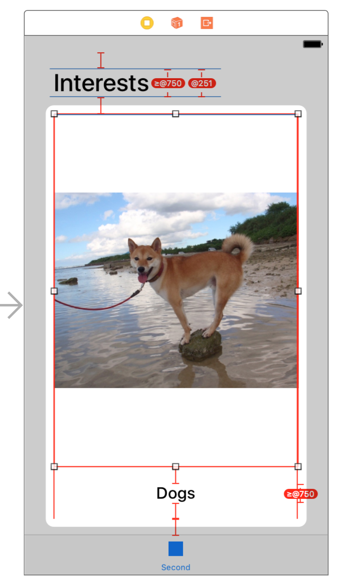
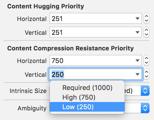
Now that the Image View and Label both have intrinsic sizes, they’re competing for the same space. We need to lower the Content Compression Resistance Priority of the Image View.
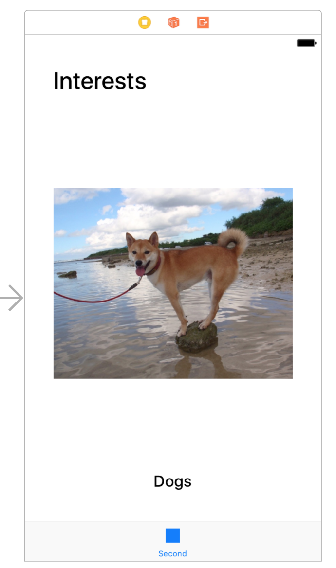
Select the Image View, open the Size Inspector (ruler button), and scroll down to the bottom. You can set the Content Compression Resistance Priority to any number smaller than 750.

With a proper Content Compression, everything should look great:
Multiple Subviews
With the first subview ready to go, let’s go ahead and duplicate it. Just select it in the View Hierarchy and hit it with a ⌘C ⌘V.
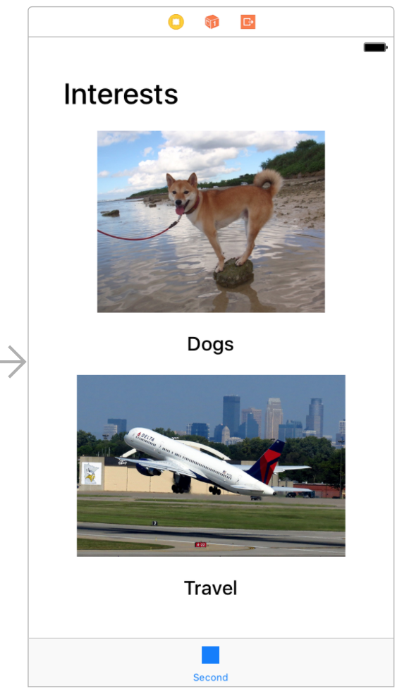
Everything will probably start looking a little crazy:
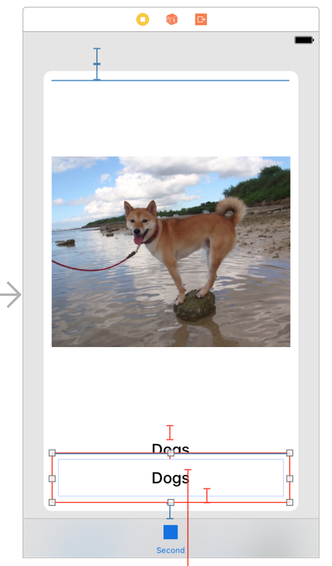
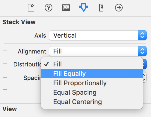
This is a simple fix, though. Like ambiguous constraints, we haven’t given the Stack View enough information about how to layout multiple subviews. Select the Stack View itself and change its Distribution property to Fill Equally. This will say that every subview gets the same percentage of available space. In our case, every subview will get 50%.
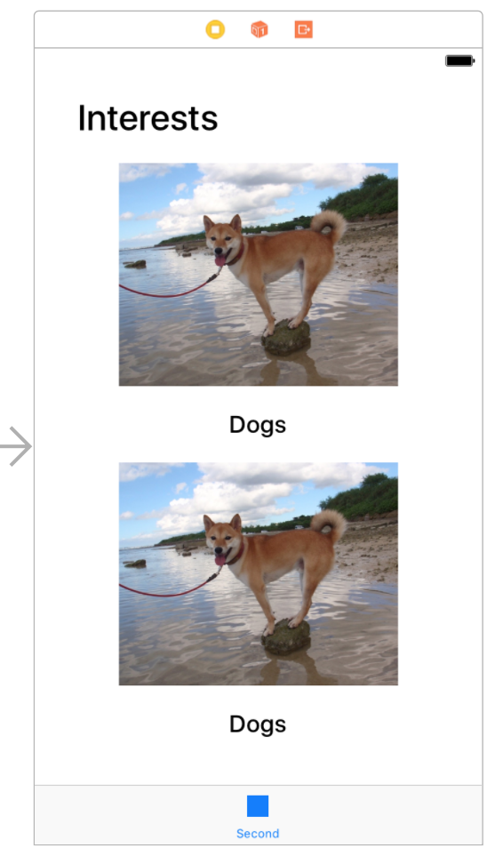
Everything will still be out of whack, but the subviews are just waiting for their frames to update. For the labels and image views, select them and run a ⌘⌥=.
You could also select the Stack View itself and click the Update Frames button (far left button with the constraint settings).

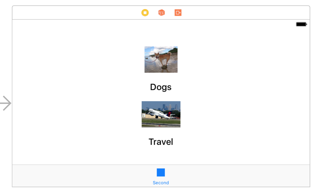
Now everything should look great!
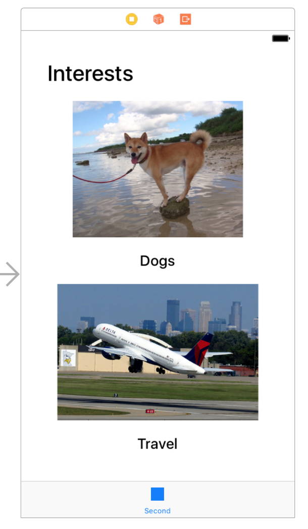
You can take a moment to find another image and set it in the image view. Since we just duplicated the other subview, you shouldn’t have to worry about Content Compression this time.
What happens in Landscape?
Everything looks awesome so far, but we’ve only thought about what happens in Portrait mode. What about Landscape? The available height is much smaller in landscape, so it might cause some problems.
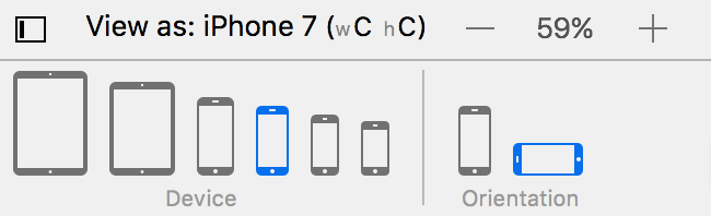
We can check pretty easily in Interface Builder. At the bottom left, it should say View as: iPhone 7. You can click that text and it should pop open a set of device sizes, from iPad Pro to iPhone 4s. You can toggle into Landscape mode on the right side.

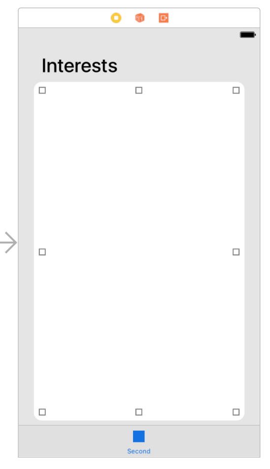
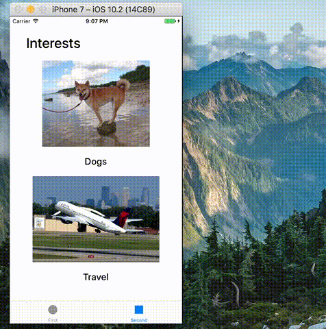
All of the View Controllers should switch to their landscape orientation. You’ll notice that the one we’re working on definitely has some problems:
We could fix this by changing our Vertical Stack View to a Horizontal Stack View, but then it would be Horizontal in portrait mode and probably look even worse.
Size Class Variations
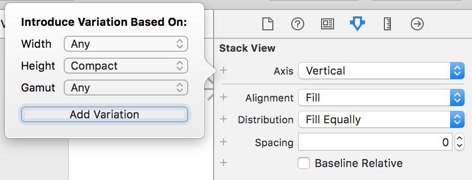
Size Classes are different categories of device size. This article by Use Your Loaf has a good abstract explanation of Size Classes, but we won’t dive too deep for now. What you specifically need to know is that in Portrait an iPhone has Regular height, but in Landscape it has Compact height.
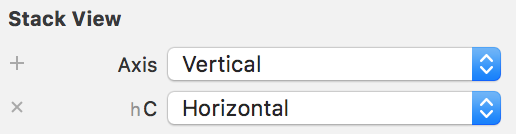
We can vary our layout based on these size classes. If you select the Stack View, you can add a variation for Layout Axis by clicking the plus button on the left. Select Width: Any and Height: Compact.
Set the Compact Height layout axis to Horizontal and everything should snap in place:
If everything is set up correctly, the Stack View should switch back to its Vertical layout:
If that didn’t convince you Stack Views are awesome and super useful, check out this sweet rotation animation we get for free thanks to our size class variation:
Wrap Up
We covered a lot of new topics, but made some great progress! You build an About Me app using Autolayout constraints, nested views, Stack Views, and more – all without writing a line of code! This is a real testament to the power of Interface Builder.
If you have any feedback on this tutorial, found something particularly difficult to understand, or got stuck on a weird bug, you can reach out to us on our Facebook group.
https://www.facebook.com/groups/iosgatech/