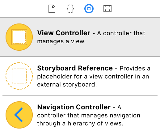
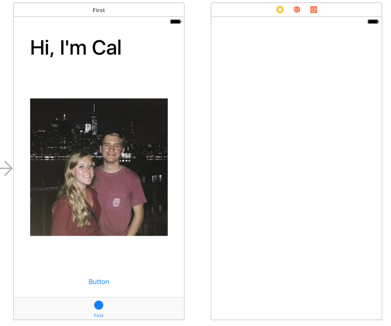
Let’s add another View Controller to the canvas. You can drag one in from the View Pallete.
Adding a Segue
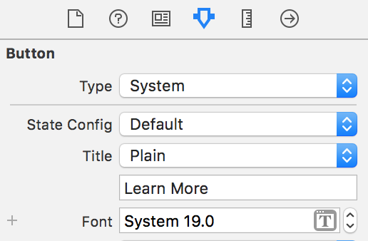
When the user taps the button, we want the new View Controller to appear. This is a good time to update the text on the button from earlier:
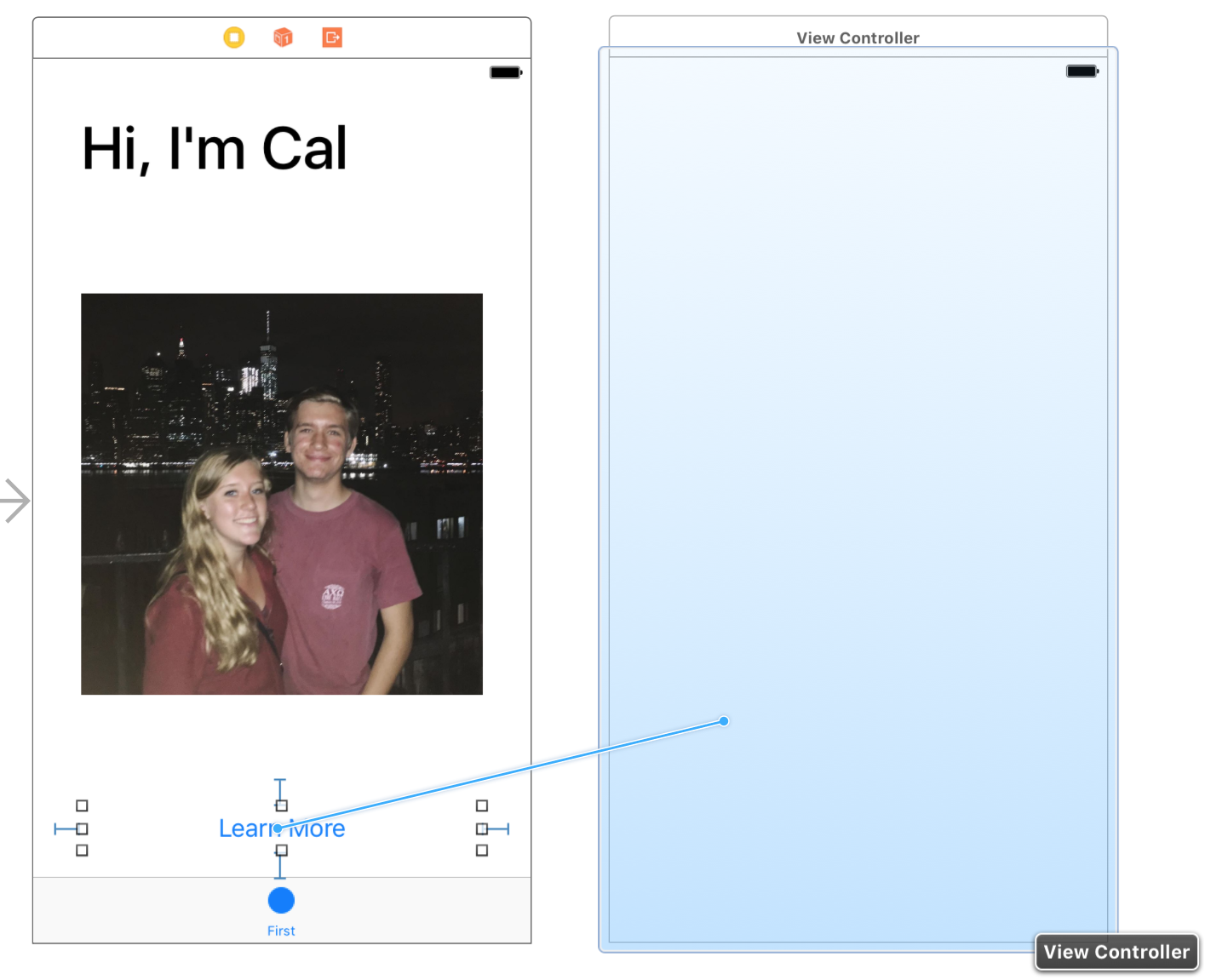
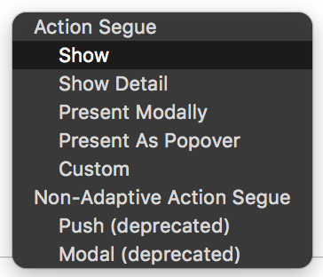
When a new View Controller is presented, it’s called a Segue. You can add a segue by control-dragging from the button to the new View Controller:
Select the Show segue type:
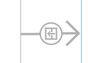
Now the two View Controller should be linked together by a segue:
Thinking about a layout
For this screen, we want to add two fun facts about yourself, which will need two separate labels. They would look best as a group centered in middle of the screen. The easiest way to do this is by creating a set of nested views. If we put the two labels inside of a container view, we can center that view in the screen.
Setting up our container view
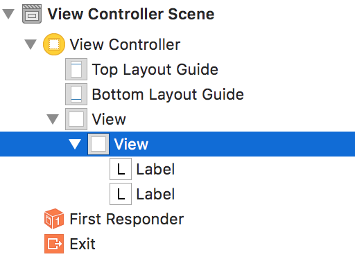
Add a View to the canvas, and add two labels inside it. Check the view hierarchy to make sure the labels are actually inside the view.
Adding constraints
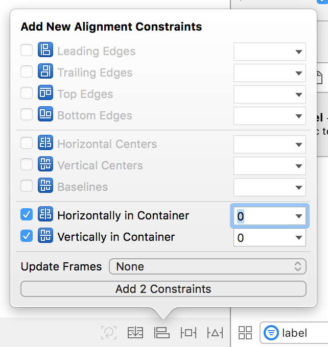
We want the container view itself to be centered in the screen. You can add those constraints by clicking the Align button in the bottom right. Check Horizontally in Container and Vertically in Container:
Right now, your container should have red lines around it.
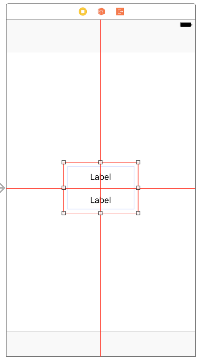
That’s okay. Red means that there are missing constraints (or conflicting constraints). In this case, the container has its x and y constraints from the center constraints that we’ve made, but it has red lines because it’s missing its width and height constraints. Those will be determined by the constraints from the two labels, which we’ll set up right now:
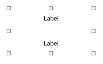
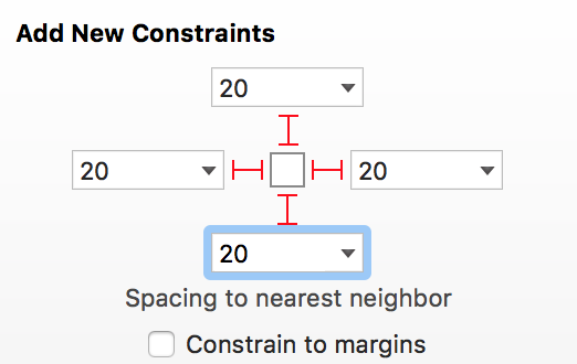
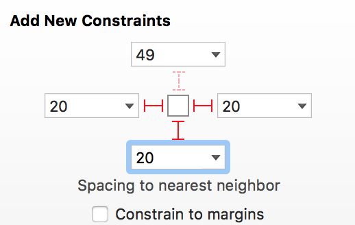
For the labels, we’ll set their top, bottom, left, and right spacing to 20:
Together, these sets of constraints look like this:
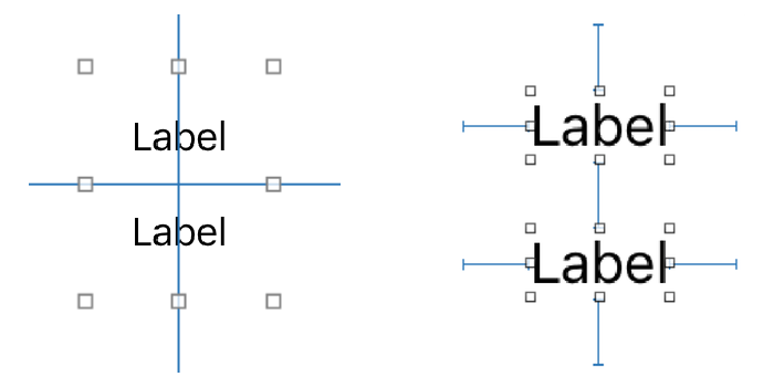
Now, whenever the labels change in size, the parent container view should change in size as well. That’s because the spacing constraints of the labels push out on the width and height of the parent container. Therefore the parent container knows its x, y, width, and height constraints and all the constraints are satisfied.
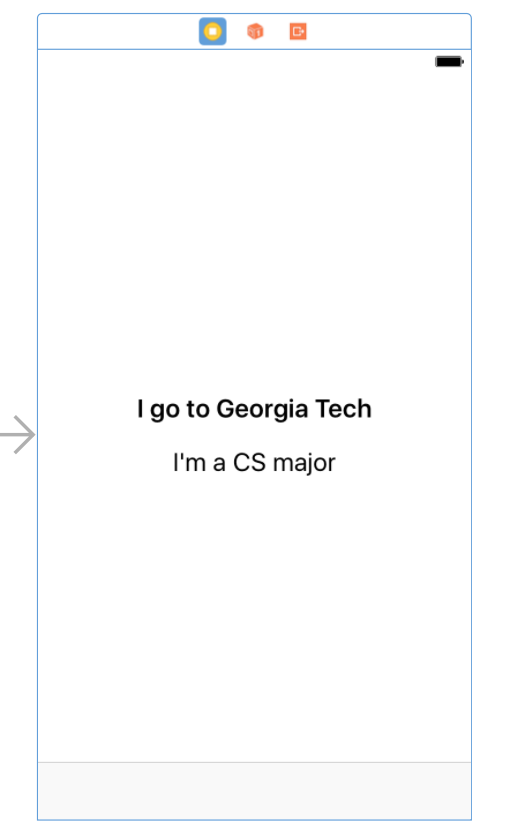
Customizing the labels
With the labels constrained, we’re ready to customize them. Now’s a good time to whip out your back-pocket fun facts.
As usual, select the labels and visit the Attributes Inspector. Customize them however much you like. As you update the labels, they should update automatically and grow as needed.
Testing our segue
The View Controller came together nicely, so now we can test out the segue in the simulator. When you run the app and tap the button, you’ll quickly notice that there’s no way back to the previous screen:
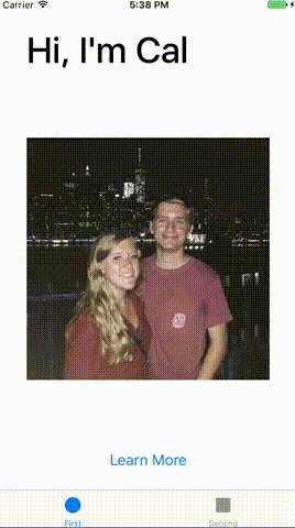
Most apps solve this by using a Navigation Bar. When a new screen pushes onto the navigation stack, there’s a Back button in the top left.
Adding our own Navigation Bar
An app’s Navigation Bar is managed by a Navigation View Controller. It’s a special kind of View Controller that other content is embedded in.
Select the first View Controller by clicking on the white bar at the top:
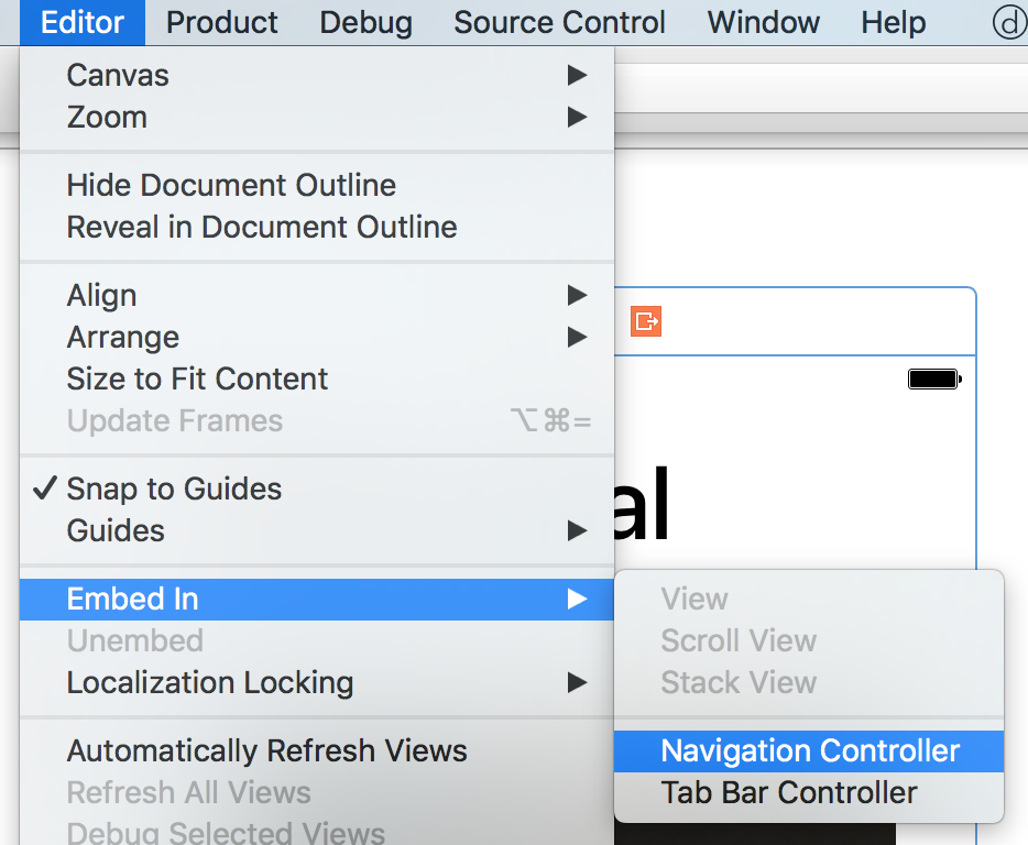
In the menu bar, click Editor > Embed In > Navigation Controller.
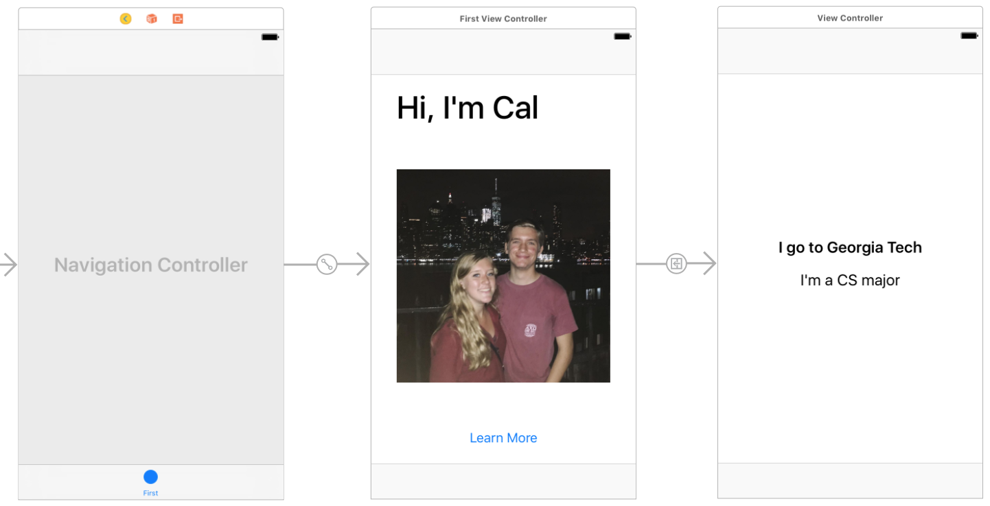
Now, a Navigation Controller should be inserted between the Tab Bar Controller and the first View Controller we worked with:
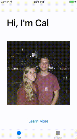
If you run the app in the simulator again, you should see everything is working great!
In Part 5, we’ll start working on the app’s other tab.